
Golden Fresh – Seafood 2026
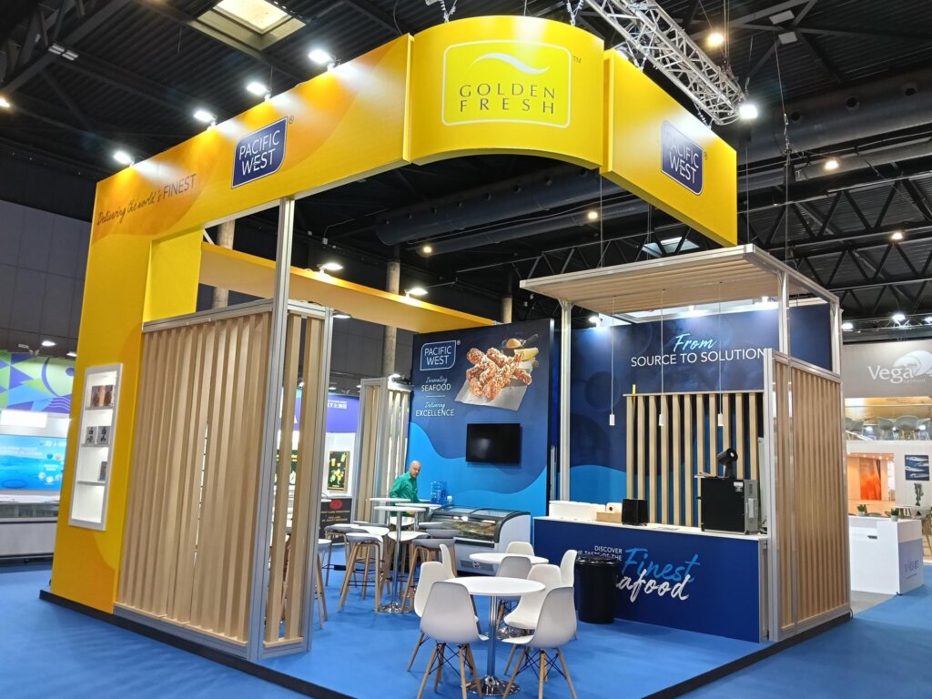
We designed a large-format upper structure in a vibrant yellow that acted as the main visual draw, integrating the brand’s logos into curved and straight panels. We opted for a defined chromatic contrast by installing blue carpeting across the entire surface and cladding the main walls in the same tone. We constructed a large-volume side totem that housed a recessed and backlit display case for the exhibition of product boxes. We created partial privacy zones using light-colored wooden slats arranged vertically, combined with exposed aluminum profiles that added solidity to the ensemble. We developed a functional bar area with a branded blue front, crowned by a wooden ceiling structure from which we suspended individual light fixtures. For general lighting, we distributed high-intensity spotlights across the upper structure, oriented toward the large-format wall graphics. We equipped the space with clean-lined furniture, consisting of circular white tables, Nordic-style chairs with wooden legs, and high stools on chrome bases. We integrated technical elements such as a video screen on the central panel and a horizontal freezer display with a curved glass lid for direct product exhibition. We finalized the project with applied graphics that included corporate slogans such as “From source to solution” and high-resolution product photographs over the blue backgrounds of the stand.
Australia – Seafood 2026
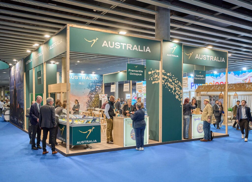
For the Australia project at SEAFOOD 2026, we designed an open and modular structure that stood out for its balance between warmth and modernity. We used a combination of light wood for the vertical profiles and upper beams, providing a natural aesthetic that contrasted with the panels and the perimeter frieze in a deep bluish-green tone. This frieze, where we installed the country’s name and white logo, guaranteed high-impact visibility from the pavilion’s main aisles. We built a functional interior space divided into various workstations, each identified by suspended signage featuring the names of the participating companies. We developed customized counters with wood finishes and backlit fronts that allowed for the display of detailed product graphics. Furthermore, we integrated horizontal refrigerated display cases and a kitchen area equipped with induction hobs and a sink, facilitating technical operations within the stand. We opted for a powerful visual narrative through the installation of large-format photographic murals covering the main walls, showcasing coastal landscapes and harvesting scenes. For the meeting areas, we selected Nordic-style furniture consisting of white circular tables and high stools with light wood legs, matching the laminate flooring installed to define our surface area. The lighting was addressed with LED spotlights integrated into the upper structure, ensuring clear exposure for all branding areas.
Alnea – Alimentaria 2026
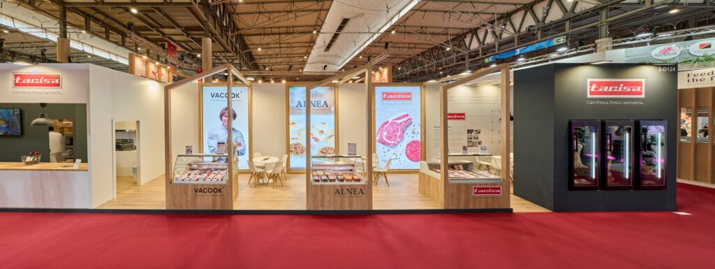
For the ALNEA stand at Alimentaria 2026, we designed an open structure that stood out for its use of light wood porticos in the shape of gabled roofs, creating clear visual zoning without closing off the space. We combined pure white wall surfaces with a large graphite gray side block, achieving a balanced architectural contrast. We opted for wood-finish laminate flooring that provided warmth and continuity throughout the entire exhibition area. We integrated powerful large-format lightboxes as rear enclosures, where we installed backlit graphics featuring product images and the corporate identity of the brands. We developed a technical lighting system that combined recessed spotlights in the upper structures with black industrial-design pendant lamps, strategically positioned over the bar and customer service area. We built several counters and refrigerated display cases integrated into wood-finished furniture, allowing for direct product display under curved glass. In the dark block, we recessed three vertical refrigerated cabinets with glass doors and interior lighting to highlight the merchandise. For the work and lounge areas, we selected furniture consisting of white circular tables and designer chairs with wooden legs, reinforcing the clean aesthetic of the ensemble. We created a long perimeter bar area with a wooden countertop and white base, complemented by a digital screen embedded in the side wall for visual content playback. Finally, we installed planters with natural plants around the stand’s perimeter to define traffic flow and provide an organic finish that contrasted with the straight lines and technical finishes of the construction.
Nestea – Alimentaria 2026
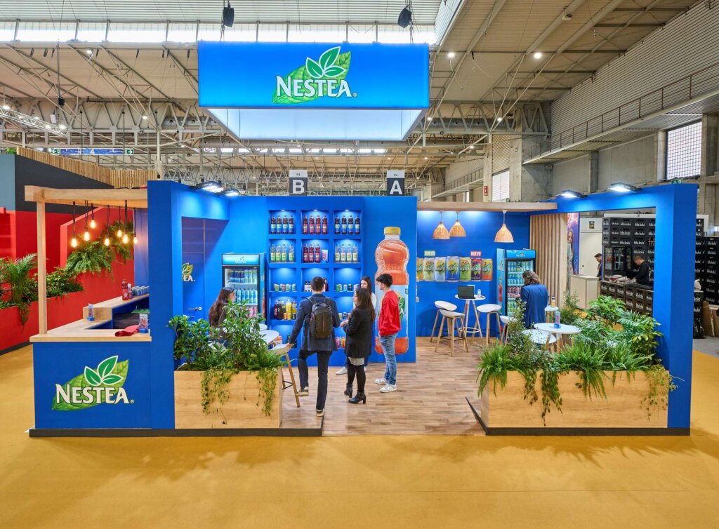
For the Alimentaria 2026 edition, we developed an open space where the brand’s vibrant blue was the absolute protagonist. We built a solid perimeter structure that delimited the various interaction areas, topped by an imposing suspended light box that guaranteed the visibility of the logo from any point in the pavilion. We opted for light wood-finish flooring that brought warmth to the overall design, creating a balanced contrast with the cool tones of the walls and the technical lighting from the overhead spotlights. We integrated natural elements through strategically placed wooden planters, which housed lush vegetation to zonify the space organically. We designed a bar area protected by a structure of exposed wooden beams, from which we suspended vintage-style filament lamps that reinforced the welcoming character of the service point. In the meeting area, we installed a vertical wood slat wall and woven wicker lamps, achieving a coherent aesthetic that combined noble materials with the corporate design. We constructed a central display panel with backlit niches where we organized the range of packaging, highlighting each product individually through integrated light points. We integrated refrigerated display cases directly into the partitioning and applied large-format graphics, including a large-scale reproduction of the lemon bottle and a composition of the different varieties of cans. The furniture was completed with high circular tables and white stools with wooden legs, distributed to facilitate visitor flow and commercial activity within the stand.
Damm – Alimentaria 2026
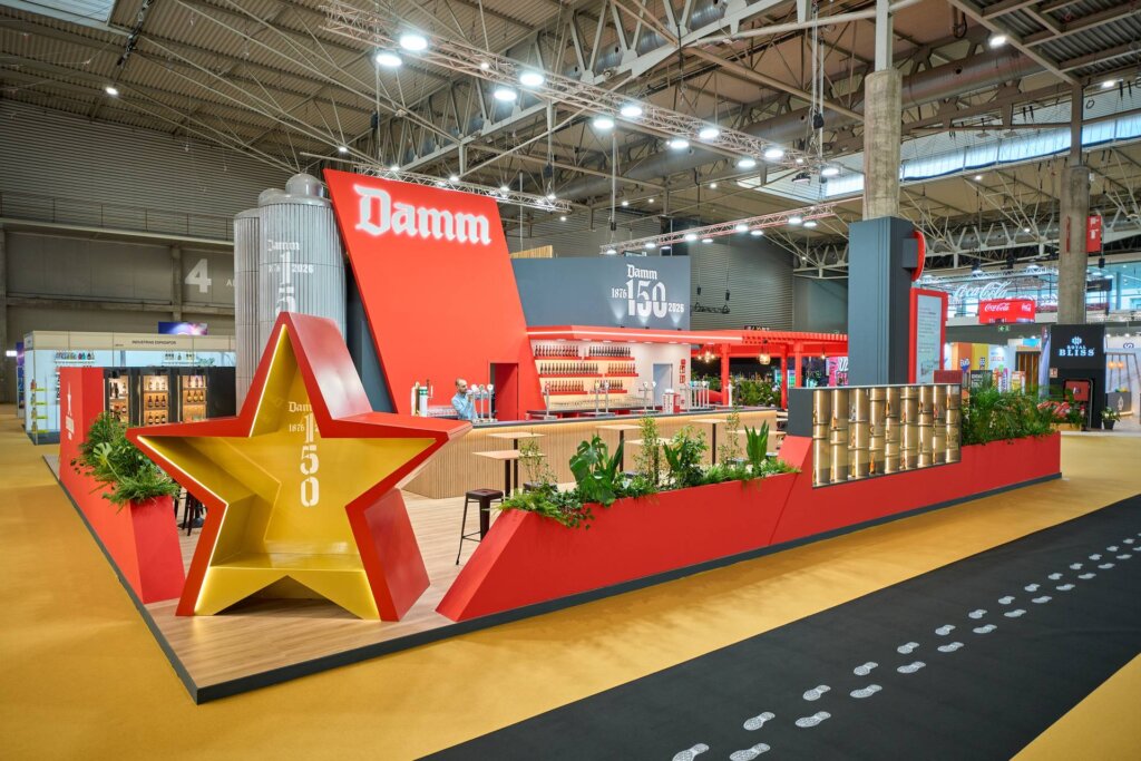
For Alimentaria 2026, we designed and built a high-impact visual space where corporate red and the 150th-anniversary commemoration took center stage. We erected a main structure defined by an imposing slanted wall with a backlit logo and three large metallic silos in a silver finish that featured commemorative graphics for the years 1876-2026. To define the stand, we opted for a red perimeter base that functioned as a planter, adding freshness through natural vegetation—primarily large-scale ferns and palm trees—that surrounded the entire perimeter. In the central area, we developed a long bar with a vertical wood-slat front and a dark gray countertop, equipped with multiple taps and backlit shelving for bottle displays. We created various lounge environments, highlighting an area under a red-beamed pergola where we installed light wood tables and black chairs with wooden legs. For the lighting of this space, we selected geometric design pendant lamps and glass spheres that provided warm, ambient light to the overall setting. We integrated unique architectural elements, such as a large three-dimensional star in red and gold that served as a visual landmark at one of the stand’s corners. On the interior walls, we installed a large-format lightbox featuring graphics dedicated to the 150 years and a bottle cap symbol, alongside recessed display cases with wooden shelves and linear LED lighting to highlight the products. The entire project was set on a natural wood-finish platform floor, which visually unified the different work, exhibition, and lounge areas.
Mercamadrid – Seafood 2025
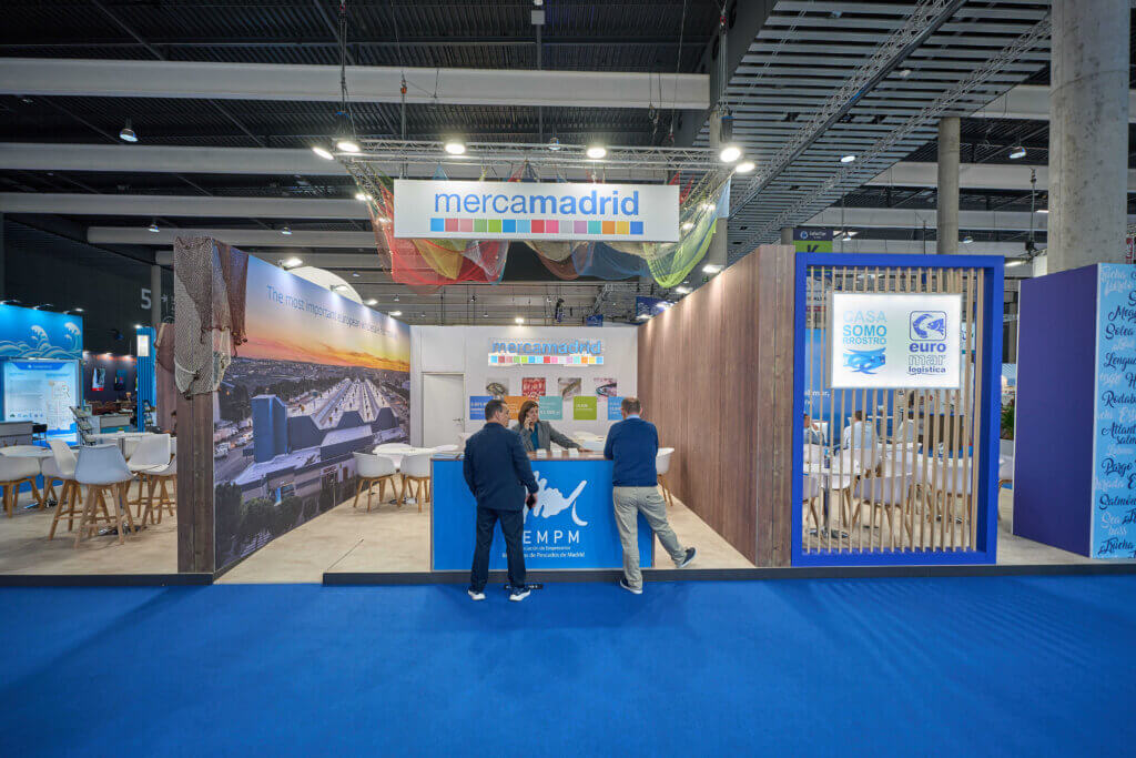
This was the space we designed at Servis for Mercamadrid at the Seafood Expo Global 2025 trade show: a corporate stand, shared by several co-exhibitors and built with our Visual Wall modular system, which stands out for its lightness, speed of assembly, and graphic customization. With a clean, professional, and functional image, the stand allowed Mercamadrid to showcase its leadership in the agri-food sector, while also offering individual visibility to the companies that were part of the space. Each co-exhibitor had its own point of attention within a common design, maintaining a coherent and modern aesthetic that reflected the values of innovation, sustainability, and collaboration. The Visual Wall construction system was key to shaping the project: its lightweight and customizable structure allowed us to integrate differentiated zones, large-format graphics, and meeting areas, all in an open and well-organized space.
Ventisqueros – Seafood 2023
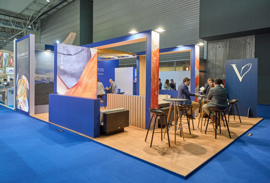
The booth designed for Ventisqueros at the Seafood Expo Global 2024, held in Barcelona, was developed in a 7 x 8.9 m² space with a height of 3.45 meters, following an open and functional design that reflected the essence of the brand. The structure included large-format panels that captured attention with high-quality images of their main products, such as Coho salmon, creating a visual impact that reinforced their value proposition. Inside, practical areas for meetings and networking spaces were distributed, equipped with high and comfortable furniture to facilitate interaction between attendees. The choice of materials and finishes, with the corporate blue as the predominant color and wood accents, brought warmth and professionalism to the whole, in addition to creating an environment in which visitors felt welcome.
Mercamadrid – Fruit Attraction 2024
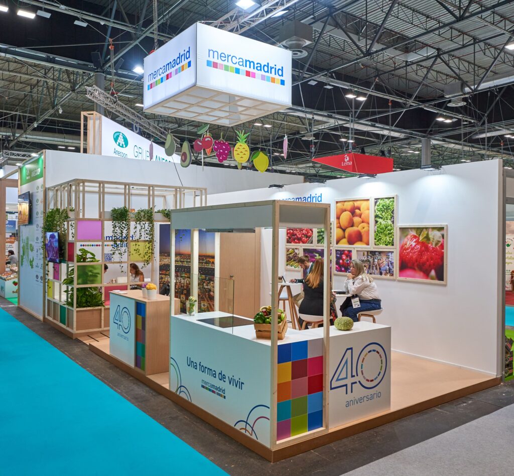
At Fruit Attraction 2023, we had the honor of designing and constructing a 34 m² stand for Mercamadrid, with an imposing height of 6 meters, a project that reflected not only its trajectory as a leader in the agri-food sector, but also its commitment to innovation and sustainability. The design stood out for its open and luminous structure, which combined vibrant colors and carefully integrated plant elements, creating a fresh and welcoming space that invited attendees to approach. The stand was organized into different functional areas, beginning with a reception area featuring a counter decorated with the representative colors of Mercamadrid’s 40th anniversary, a detail that not only celebrated its history, but also added a distinctive and memorable visual touch. Next to this area, an exhibition area allowed visitors to immerse themselves in the essence of Mercamadrid through images that represented the daily activity of the market, reinforcing its position as one of the most important agri-food centers in Europe. In addition, a space was set aside for more private meetings, where clients and collaborators could establish contacts and dialogue in a comfortable and functional environment.
Estrella Damm – Alimentaria 2024

We took charge of transforming the design into reality, ensuring that every construction detail, from the bottle arrangement to the wooden structures, reflected the Damm brand’s vision. The entire process, from installation to dismantling, was executed with precision and within the established timeframe, allowing our client to focus on what mattered most: connecting with their visitors and showcasing their authentic Mediterranean essence.
Calconut – Alimentaria 2024
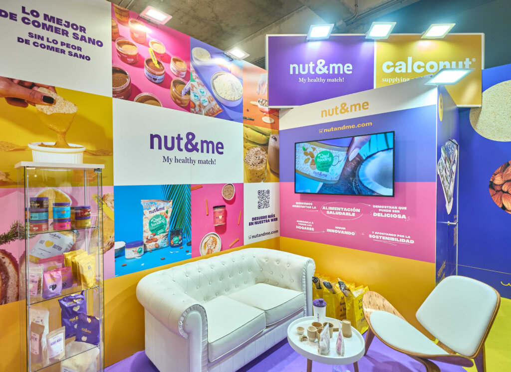
In the 2024 edition of the Alimentaria fair, we designed and produced a 5×5 meter stand for Calconut that stood out for its colorful aesthetics, brand clarity, and careful product display. The space was divided into two well-defined areas: one for visitor attention with a tasting counter, and another more relaxed area, designed for conversations and rest. The counter, located at the front of the stand, incorporated the nut&me logo—Calconut’s consumer brand—on a white background, accompanied by a careful presentation of the products: from nut butters to healthy snacks. Just behind it, a double-height graphic background displayed full-color images of natural ingredients such as pistachios, almonds, and coconut, along with the Calconut and nut&me logos. A screen integrated into the panel played branded content. The use of color played a fundamental role in the design: the floor alternated between purple and orange tones, creating a clear visual division between areas and reinforcing the brand identity. Spot lighting on the background and products ensured good visibility without saturating the space. A 25 m² stand that took advantage of every corner to communicate, generate experience, and reinforce Calconut’s brand values with an attractive and coherent visual proposal.